In my first post, I talked about some of the common asset allocations among the FIRE community, along with other more common asset allocations:
| % Stocks | % Bonds | 40-yr SWR |
|---|---|---|
| 100 | 0 | 4.1% |
| 88 | 12 (cash) | 4.4% |
| 80 | 20 | 4.2% |
| 60 | 40 | 4.1% |
| 40 | 60 | 4.0% |
I also included three alternative asset allocations with much higher safe withdrawal rates (using historical data since 1970):
- AAA 1 - 5.1%
- AAA 2 - 6.0%
- AAA 3 - 4.8%
It’s pretty cut-and-dry, isn’t it? We should just pick AAA 2 and get to FI faster, right? Not so fast, there are problems with AAA 2.
Now, for the big reveal. Here are the different asset allocations:
Dissecting the Golden Butterfly
“AAA 2” is the Golden Butterfly from PortfolioCharts.com. PortfolioCharts.com is one of my favorite sites to play around on, and I have been enamored with the Golden Butterfly for quite some time. The Golden Butterfly is a very simple and unorthodox asset allocation:
- 20% total US stock market (TSM)
- 20% US small cap value (SCV)
- 20% long-term Treasury Bonds (LT)
- 20% short-term Treasury Bonds (ST)
- 20% gold
Wait, what?
- Only 40% in stocks? Half of that in small cap value? No international stocks?
- 20% in gold, that has a long-term return of about 1%?
- 20% in long-term treasuries, with their very high risk due to interest rate sensitivity?
- 20% in short-term treasuries, which are roughly equivalent to a high yield savings account?
Yes, well, the facts speak for themselves. You can read more about the theory behind it, but the short answer is that these assets are mostly uncorrelated, so losses in one are offset by gains in another, and you never (historically speaking) face a deep drawdown. Since 1970, it outperforms just about every other asset allocation with growth similar to a stock-heavy portfolio and drawdowns that are minimal. Sounds awesome, right?
Not so fast
I decided to dissect the Golden Butterfly portfolio to see how this simple portfolio gets its results. So, rather than rely on the beautiful data on PortfolioCharts.com, I decided to look at the results of some tests using Portfolio Visualizer. I’m mainly interested in the safe withdrawal rate of various portfolios, so for the backtest on Portfolio Visualizer I started with a $1 million portfolio and withdrew $40k every year (adjusted for inflation), and rebalanced annually. What were the results?
First thing, I ran into a problem: Portfolio Visualizer only has data going back to 1978 on long-term treasuries.
According to the way the Golden Butterfly is described on Portfolio Charts, the portfolio includes “a bond barbell with long term and short term treasuries,” as if there is some magic to holding both long- and short-term treasuries at the same time. Since Portfolio Visualizer does not have long-term treasury data before 1978, I had a hunch: 20% long-term treasuries and 20% short-term treasuries should behave like 40% intermediate term treasuries. Let’s try that and see what we get:
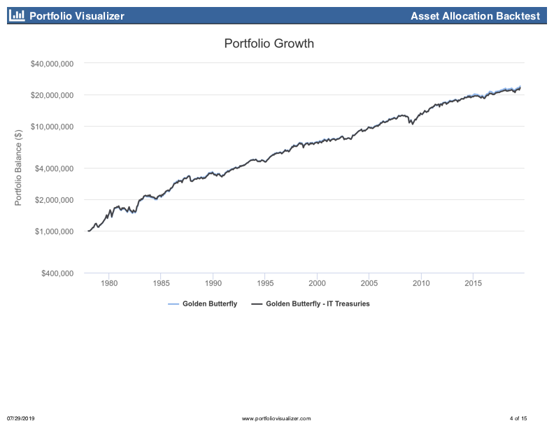
I’ll be darned. That’s almost identical. There seems to be nothing magical about holding equal weights of long- and short-term treasuries. Holding long- and short-term treasuries makes for a compelling portfolio narrative and a nice, equal weighting of 5 different asset classes, but it’s not necessary; 40% intermediate term treasuries will fit the bill.
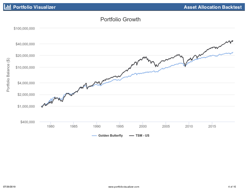
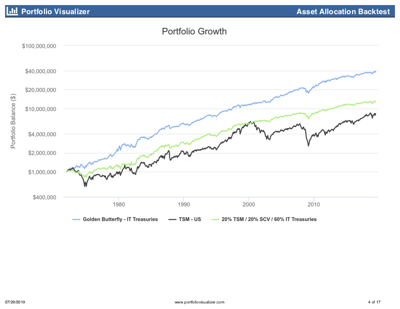
So, now, let’s compare the modified Golden Butterfly to a 100% total US stock market portfolio since 1972.
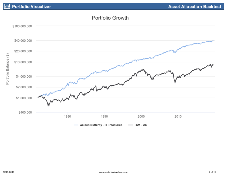
Wow. Using the Golden Butterfly since 1972 results in a portfolio balance nearly five times bigger than investing only in the total US stock market, and that’s after withdrawing $40k a year. Not only did the GB earn a higher return, its deepest drawdown during the 2007-9 bear market was only 17%, compared to 51% for the TSM portfolio. So, the GB gave you better returns with much less volatility. Look at that drawdown chart:

Looks like a clear winner, right? Well, let’s keep digging. The average retiree is not in a 100% TSM portfolio, they are usually in something like a 60/40 stock/bond portfolio. That is a better benchmark for the GB, which seeks good returns with low volatility, just like a 60/40 portfolio. Adding the 60/40 portfolio gives us this:
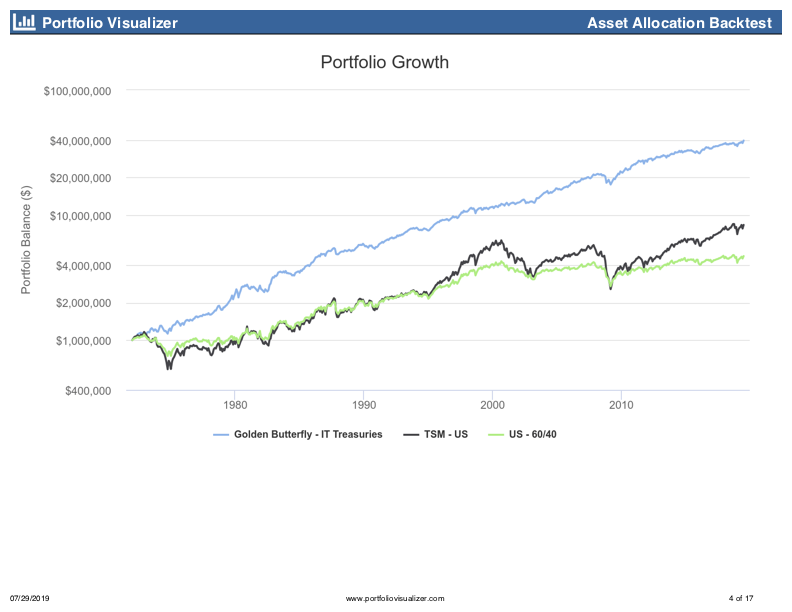
The 60/40 doesn’t give better returns, but it does have lower volatility, and up through 2009 a 60/40 portfolio kept up with a 100% TSM portfolio. Only since the recent bull market has the 60/40 portfolio significantly underperformed.
Okay, but let’s keep thinking through this. The GB only has 40% in stocks, so maybe there is some benefit from having less in stocks. Not only that, but half of the GB stock allocation is in small-cap value, which we know delivered outsized returns historically. So, let’s use 20% TSM and 20% SCV, just like the GB.
The key question, really, in the GB is: what difference does gold make? It’s used as a non-correlated asset to stocks. So, let’s just up our test portfolio to 60% intermediate-term treasuries and see what we get.
Now that is interesting. We took away our allocation of stocks, added more bonds, and we returned more than a 100% TSM portfolio. We are learning that part of the secret sauce to the GB is twofold:
- A low allocation to stocks at a time when stocks are about to nose-dive (early 1970s).
- A high concentration of those stocks that remain in small-cap value so that stock returns are supercharged beyond what you might expect from a paltry 40% allocation.
The start dates really matter for the GB. Let’s isolate the 1970s all by themselves.
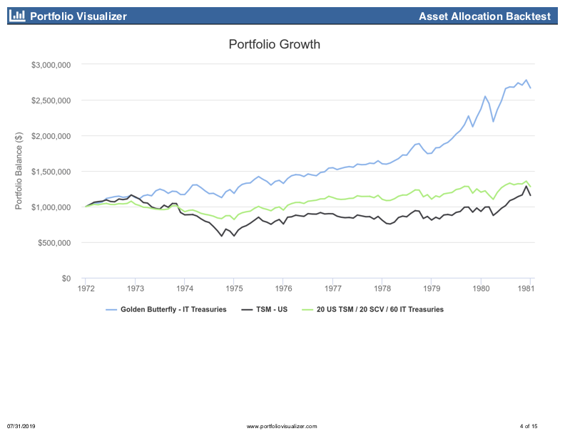
By 1980, the GB has over twice the portfolio value of the other two portfolios. That is a pretty big head start that neither portfolio has been able to catch up to, yet.
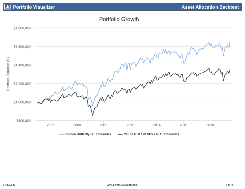
But what if we started using that portfolio in 1980?
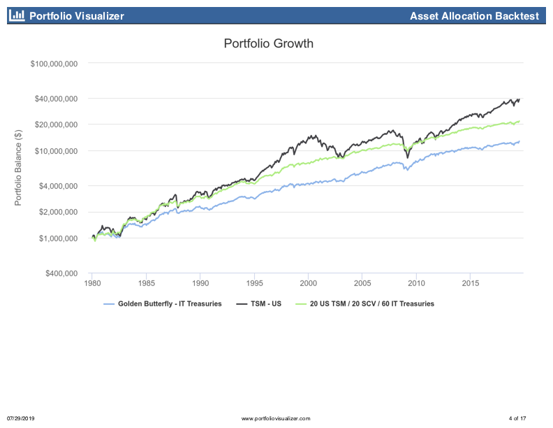
Wow, again. Since 1980, the GB has underperformed a plain old 20/20/60 portfolio to the tune of $9 million. Not only did the GB have lower returns, but it had worse risk-adjusted returns (see Sharpe and Sortino ratios in the link). It also had an ever-so-slightly higher drawdown than the vanilla 20/20/60 portfolio. How would the GB have performed during two of the more recent times of trial?
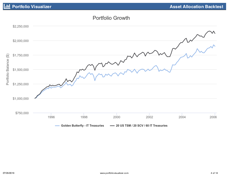
From 1995-2005, which included the dot-com crash and September 11, the GB had a lower CAGR, deeper drawdown, and worse risk-adjusted returns than a 20/20/60 portfolio. So, gold didn’t do much to help you there. What about during the Great Recession?
Again, results are very similar: the GB had a higher CAGR over this period, but a deeper drawdown and worse risk-adjusted returns than a 20/20/60 portfolio.
Lessons
-
Minimizing drawdowns early in the withdrawal phase of a portfolio is supremely important. The GB underperforms a TSM portfolio since 1975. However, during those first years of 1972-1975, the GB outperforms the TSM enough to return a portfolio worth nearly $40 million in 2019, rather than $13 million for the TSM. This doesn’t mean you need the GB asset allocation, but that your number one priority during the first few years of retirement is to minimize portfolio volatility as much as possible.
-
The start date for a backtest matters immensely for a withdrawal portfolio. Whatever portfolio can minimize drawdowns during the first few years of retirement will almost certainly outperform other asset allocations for a very long time period. The problem is, we don’t know ahead of time which assets will guard us against the deep impending drawdown.
-
The 1970s were very odd, and about the only thing that saved a portfolio was gold. If you think we are likely to have a repeat of the 1970s, then maybe holding 20% in gold is a good idea. But for the last 44 years you would have been better off holding treasuries instead of gold. (Actually, if you think the 1970s are going to repeat, you should hold 40% SCV and 60% gold: that allocation laughs at the GB returning a paltry 8% CAGR and turning a $1 million portfolio into $40 million. A 40/60 SCV/gold portfolio would be worth $112 million today. Although, since 1980, that portfolio has returned only 1.5%. It’s entire outperformance came in the first eight years from 1972-1980.)
-
A heavy allocation to small-cap value supercharged the GB portfolio returns. SCV earned way more than the S&P 500 since 1972: 13.9% versus 10.27% CAGR. SCV turned $10k into nearly $5 million, while the S&P gave you only $1 million. While there may still be a small-cap and value premium, many people I respect in the investing space think it is unlikely we will see that much outperformance by SCV ever again.
-
Interpret your data. I love Portfolio Charts and think that the site’s owner, Tyler, has done an immense service for the investing community. However, you have to interpret the data he provides. If you are looking at 40-year safe withdrawal rates, how many 40 year periods have there been since 1970? Nine, all starting in the 1970s. The best performing portfolios over any 40-year time period will be biased toward those portfolios that performed well during the 1970s. Two things supercharged the GB safe withdrawal rate: huge outperformance by gold during the 1970s and long-term outperformance of SCV over the TSM. If you think those two scenarios are unlikely for our future and you plug in a 40/60 TSM/IT portfolio into the My Portfolio page on Portfolio Charts, you get a 40-year safe withdrawal rate of 4.0%.
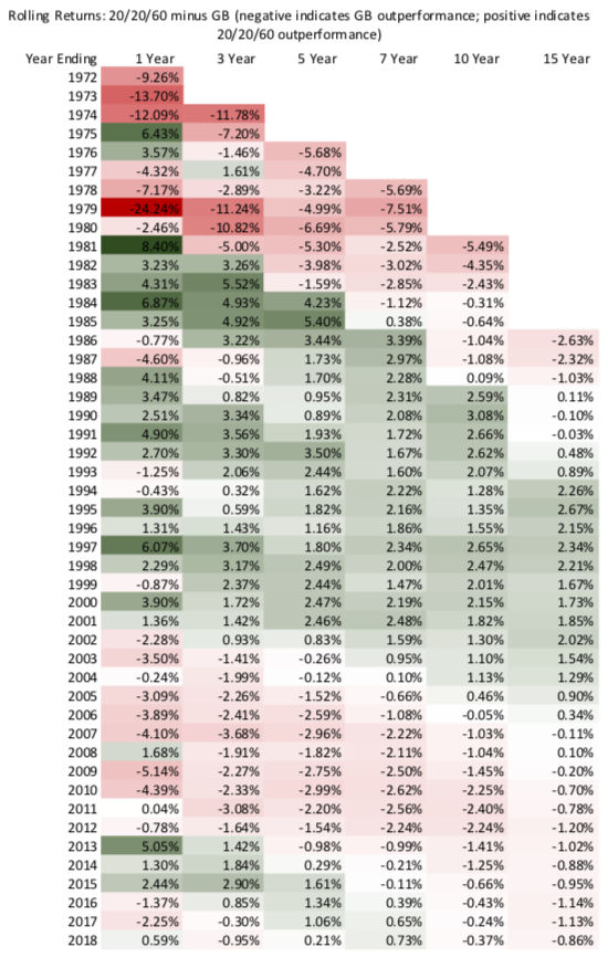
Below is a chart showing the rolling returns for the 20/20/60 portfolio minus the rolling returns for the GB. Red indicates GB outperformance, and green indicates 20/20/60 outperformance. As you can see, once the 1970s are out of the equation, the performance difference is negligible between putting the last 20% of the portfolio in either gold or IT treasuries.
Conclusion
The lesson of my first post is not that there is a perfect asset allocation for all time (such as the GB) that will provide for the lowest possible volatility with the highest possible return. The point is that, historically, a portfolio that can guard against early drawdowns and lock in early returns will sustain the highest safe withdrawal rate. The GB was a great way to do that in the 1970s, and it has returned a reasonable amount since then that allows for a good safe withdrawal rate.
The GB likely won’t be the way to do that moving forward. What will? I’m not sure, but I have some ideas. Those ideas will be posts for another day.